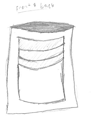
The process of this challenge first started with a small interview with the person we were partnered with, mine was a little quiet so I had to try a bit harder to get as much out of him as possible, once the interviews were over we had gone into thinking of any sort of problems that our partner might have with their wallet, with mine I noticed he like to use cards and had a lot of them, so I based my design around the thought that it must be inconvenient for him to have to open the wallet every time. after a short seven or eight minutes I finally came to a design.
Since I wasn't supplied with many great materials I ended up making the whole thing out of duct tape and sticky notes. the duct tape making up the body and the sticky notes making the pockets for credit cards and such. When I had first started I had the idea of a basic wallet in mind, only with more pockets, I soon realized that everyone else had the same Idea so I made something new, I built it with convenience in mind by making the credit card pockets on the outside, and I made it just a bit smaller than a normal bill. In the interview I learned that my partner didn't really like using cash that often, so the cash pocket is made on the inside, incase he would need it. With my original design it was more like a normal wallet but after hearing my teacher say that it didn't need to be a normal wallet I changed it to something more like this.

although it's not very pretty I believe it is a good design, I didn't really get that "A ha!" moment until later on in my sketching when I had made this design, it was shortly after we were told that it didn't have to resemble a normal wallet, after that I started thinking and eventually reached this design. I had reached this design by gaining empathy and thinking about what it must be like for him to have to take out and open his wallet every time he wanted to purchase something with his debit card, so I came up with this "pocket" like design by putting the card slots on the outside, I made it more convenient for someone like him by doing so. After all this we started prototyping and actually built our design using the materials supplied, as soon as he said "Go" I made a dash for the duct tape because I knew it would be the most reliable to work with only been given fifteen minutes to build, what took the longest was making the tape line up and having to wait for others to get what they needed from the one roll available. After finally finishing the body I had to add the pockets, the fastest way to do this was tape sticky notes to it I only had about a minute or two so I didn't get far only adding about three pockets, although not a lot it still got my point across. The whole prototyping process helped the design by putting things into an easier perspective, and helped me to understand how well this design actually worked, the only flaw I noticed was my placement of the pockets. being to close to the top and making the card stick out higher than the top of the wallet. From my partner I got relatively good feedback but he also only said that "It's good" so i'm not quite sure. If I could make another prototype I would fix the placement of the pockets and even add more, but other than that I wouldn't change it. It would be something like this.
.jpg)
If I could improve the design process, I would extend the build time to thirty minutes or more so that those who need more time have it. everything else seems fine to me and I had no further issues. Any feedback would be appreciated thank you for reading.